Saturday, 7 April 2018
There's been little improvement of the representation of female filmmakers in the Academy Awards since 2000
Men are represented seven times more than women in the nominations of filmmaking roles at the Academy Awards since 2000. According to data found from the Oscars archive, there's been a total of 54 female nominees in the categories of directing, editing and screenwriting versus 417 nominations for their male counterparts.
This year offered the most female representation in the nominations with at least one nominee in all four categories. Furthermore, this year's awards saw its first ever female cinematographer nominee, Mudbound's Rachel Morrison, as well as a total of eight female producers as nominees. But even if this was the best year for female filmmakers across all categories, there were still over three times more male nominees. More so, none of these women won.
On average, women have a 15 per cent chance of winning after being nominated in one of these four categories. Over the 17 years of data collected only seven had female award winners, most between the years of 2003-2007. Films from 2003 saw the most winners with a total of three. Fran Walsh and Philippa Boyens, along with male co-writer Peter Jackson won the award for Best Adapted Screenplay for The Lord of the Rings: The Return of the King. The other winner was Sofia Coppola when Lost in Translation won Best Original Screenplay. Coppola was also nominated for Best Director for Lost in Translation, making her at the time the third woman to ever be up for the title of best director. To date, there have been only five women to ever be nominated in the best director category, three of those being since 2000, making it the most underrepresented category for women in this study by far.
Kathryn Bigelow made history as the first (and only) woman to take home the Oscar for Best Director for the 2009 film The Hurt Locker. There was then an eight-year gap before the Director category saw another female nominee in Greta Gerwig for her semi-autobiographical film Lady Bird. Gerwig lost to Guillermo Del Toro and his film The Shape of Water.
The category of best director has fewer nominees in general compared to the other three, which does not answer for such a deep underrepresentation but explains it a little bit. Generally, there is only one director per film and therefore per nomination. In the categories of screenwriting and editing, there is more potential for groups of people to be nominated, meaning more individuals per nominations. These teams aren't necessarily all-female or all-male, making the inclusion, in general, less polarizing.
The question that arises from this study is why aren't female filmmakers being nominated? Are they not making Oscar-worthy films? Or, are there just not enough women filling these roles?
In a study conducted by the Center for the Study of Women in Television and Film, researcher Dr. Martha M. Lauzen looked at the employment of women behind-the-scenes in the top 100, 250, and 500 films from 2017. In the top 250 top-grossing films, women made up 11 per cent of all directors, 11 per cent of writers and 16 per cent of editors. Female directors saw an improvement of 4 per cent from the prior year, while the other two categories declined.
With these numbers in mind, it shows that the underrepresentation on female nominees in the Academy Awards isn't due to the lack of recognition of female filmmakers. More so, these numbers present the severe lack of women occupying these roles in general.

Sunday, 18 March 2018
Data update 3
1. Chart:
2. Unanswered question: This data shows that less women are nominated than men in these categories, but it does not tell us how many women are working in these industries. Are women not be recognized for their achievements in these roles, or are there simply not enough women in these roles?
3. How to get data: All these jobs have unions in America, some of which have public data on the diversity in their field. However, I couldn't find up-to-date data from every guild. Through a quick Google search, I found the Center for Study of Women in Television & Film, and this report which collects data from the top 100, 250 and 500 films of 2017.
2. Unanswered question: This data shows that less women are nominated than men in these categories, but it does not tell us how many women are working in these industries. Are women not be recognized for their achievements in these roles, or are there simply not enough women in these roles?
3. How to get data: All these jobs have unions in America, some of which have public data on the diversity in their field. However, I couldn't find up-to-date data from every guild. Through a quick Google search, I found the Center for Study of Women in Television & Film, and this report which collects data from the top 100, 250 and 500 films of 2017.
Sunday, 25 February 2018
Data update 2
Lead: Men are represented seven times more in the nominations of filmmaking roles at the Academy Awards since 2000.
Excel Workbook link and explanation: my spreadsheet tracks the nominations and wins since the 2000s at the Academy Awards. The spreadsheet shows the nominations and wins in the categories of directing, editing and screenwriting. I separated the data into four sets: male nominations, female nominations, male wins and female wins.
Original dataset link
News story/study link and brief explanation: This article from Variety reports that there has been little improvement in the representation of women in non-acting awards at the Academy Awards. The article refers to a report done by the Women's Media Center that women make up 23% of this year's non-acting nominees, a 3% increase from last year. This article relates to my data since I intend to show the difference in nominations in filmmaking roles, and the ratio of female to male nominees.
Excel Workbook link and explanation: my spreadsheet tracks the nominations and wins since the 2000s at the Academy Awards. The spreadsheet shows the nominations and wins in the categories of directing, editing and screenwriting. I separated the data into four sets: male nominations, female nominations, male wins and female wins.
Original dataset link
News story/study link and brief explanation: This article from Variety reports that there has been little improvement in the representation of women in non-acting awards at the Academy Awards. The article refers to a report done by the Women's Media Center that women make up 23% of this year's non-acting nominees, a 3% increase from last year. This article relates to my data since I intend to show the difference in nominations in filmmaking roles, and the ratio of female to male nominees.
Monday, 19 February 2018
Sunday, 11 February 2018
Data Update 1
1. What dataset will you use for your final report?
I will be using this search filter for finding data of Oscar nominations and wins. I plan to search for all nominees and winners in the categories screenwriting, directing and editing from the year 2000 onward.
2. Describe the dataset. What kind of data does it contain?
The data is customized to the search filters that are applied. For what I want to find out, I ran two searches: all females - nominees and winners - in the aforementioned categories between my time period and the same search but for males. Unfortunately, the data sets only come up as PDFs, so I have to manually transcribe the data into an excel sheet.
3. Is there anything about your data that you don’t understand? (i.e. what a column heading means). How will you find this out?
The data is a pretty simple set since I can customize it to what I want to know. The only issue with the data is that if a group of people is nominated together, males can show up on the female data and vice-versa. I therefore have to take the extra step to search any unisex names to confirm the gender. I also have to be careful about if there are any nominees/winners outside of these two genders. So far this has not come up in the data, which could be an interesting point as well.
4. What are some questions you hope to answer with your data? List at least three. (you don’t need the answers at this point)
I will be using this search filter for finding data of Oscar nominations and wins. I plan to search for all nominees and winners in the categories screenwriting, directing and editing from the year 2000 onward.
2. Describe the dataset. What kind of data does it contain?
The data is customized to the search filters that are applied. For what I want to find out, I ran two searches: all females - nominees and winners - in the aforementioned categories between my time period and the same search but for males. Unfortunately, the data sets only come up as PDFs, so I have to manually transcribe the data into an excel sheet.
3. Is there anything about your data that you don’t understand? (i.e. what a column heading means). How will you find this out?
The data is a pretty simple set since I can customize it to what I want to know. The only issue with the data is that if a group of people is nominated together, males can show up on the female data and vice-versa. I therefore have to take the extra step to search any unisex names to confirm the gender. I also have to be careful about if there are any nominees/winners outside of these two genders. So far this has not come up in the data, which could be an interesting point as well.
4. What are some questions you hope to answer with your data? List at least three. (you don’t need the answers at this point)
- What is the ratio of men/women nominated for "creator" roles since 2000?
- Are women simply not winning, or are they not being nominated?
- Has there been an improvement in the diversity of representation over time?
Sunday, 21 January 2018
Data Visualization Analysis

This data visualization comes from the Economist provides a look into what is considered as sexual harassment in the workplace dependent on age, sex and nationality. Surveyors asked participants if they would "consider it sexual harassment if a man, who was not a romantic partner, did the following to a woman?." The orange line represents female results and blue male. The X-axis shows the age range and the Y-axis shows the percentage of participants that agreed with the statement.
I think that the graph does a great job representing the data it's been given in regards to the type of graph that they've used. The fact that they are only comparing male to female makes it easy to compare the results on the graph. The type of graph (dual-line) is great to show the how opinions of participants evolves with age.
The Y-axis represents the percentage that the participants agreed with the aforementioned statements. Surveyors had the scale start at zero and move up to 100 but 25 intervals. I think that this works well, especially since it represented in percentages. The fact that 50% is also in the middle of the graph makes sense and allows readers to gain a better understanding.
The X-axis represents the age of the participants and is, in my opinion, unclear. The axis starts at 18

Another issue with this visualization is that there are just too many graphs in a single area. In total, there are 35 individual graphs that make up this visualization. It's difficult to compare the results of Britain's survey with that of the United States since they are so far away. If the object is to show how age and gender effect views on sexual harassment, it would have been better to do a single, more detailed graph. If the object is to compare nationalities, then there needs to be a better layout to compare data.
In summary, I feel that this graph does a great job in laying out how to represent the different in gender and age range. However, I feel that it is trying to do too much with comparing results of five different countries with seven different scenarios on top of age and gender.
Monday, 15 January 2018
Embed test
Here is the chart I want to embed.
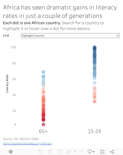
The chart I wanted to embed is right above this sentence.
The chart I wanted to embed is right above this sentence.
Subscribe to:
Posts (Atom)